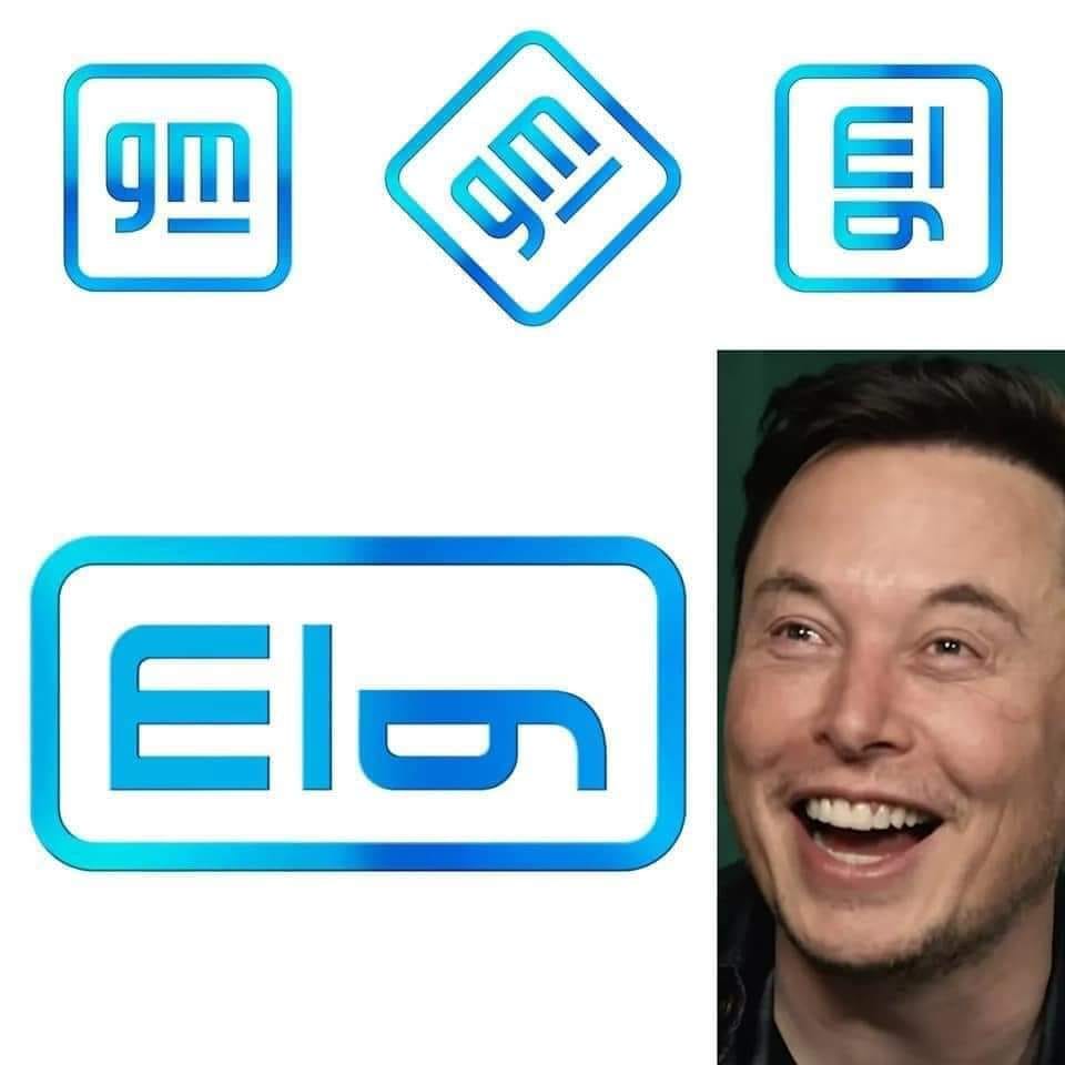
After 50 years, General Motors, once the world’s largest automaker, has given its corporate logo a new coat of paint. In doing so, the company aims to reflect the shift in the industry that is currently taking place from internal combustion vehicles to electric cars. The company logo was designed by in-house designers, and brings a transition from uppercase to lowercase letters, a slight change in colors to a blue meant to represent the blue of a clear sky, and a design of the ‘m’ meant to resemble a charging plug. The fact that the ‘g’ still looks more like a gasoline nozzle was probably not considered.
But attentive Internet users found another, hidden and probably unintentional design element. As soon as you rotate the individual parts of the logo 90 degrees counterclockwise and reposition them, the lettering ‘Elon’ appears, Tesla boss Elon Musk’s first name.

At least GM knows who to thank for the change. The logo will not appear on GM’s cars and trucks, but will be used for official letter heads.
This article was also published in German.

2 Comments